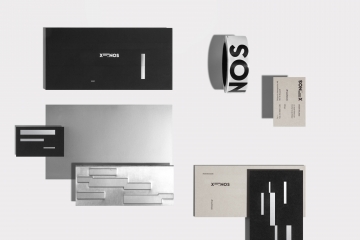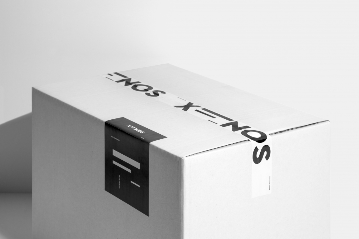

Our identity – XENOS
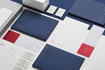
Litho | Foiling | Duplexing | Die-cutting
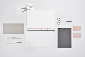
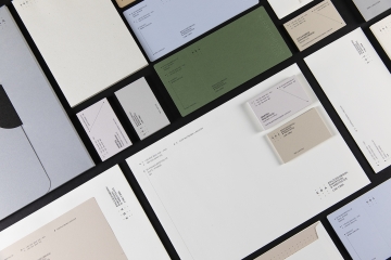
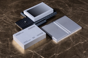
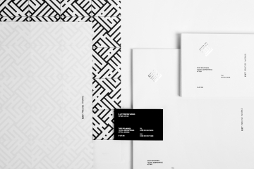
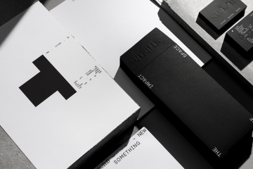
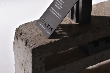
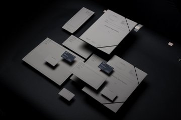
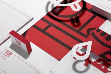
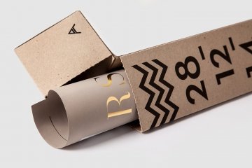
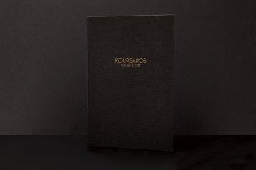
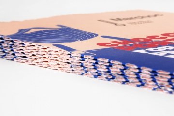
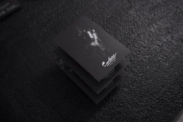
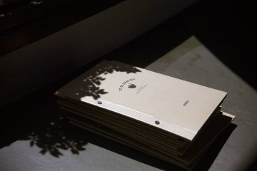
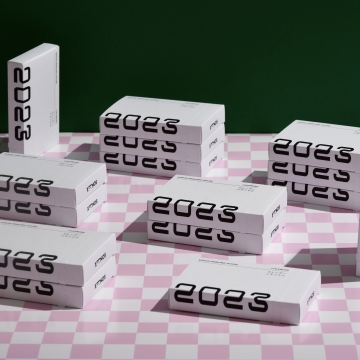
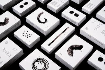
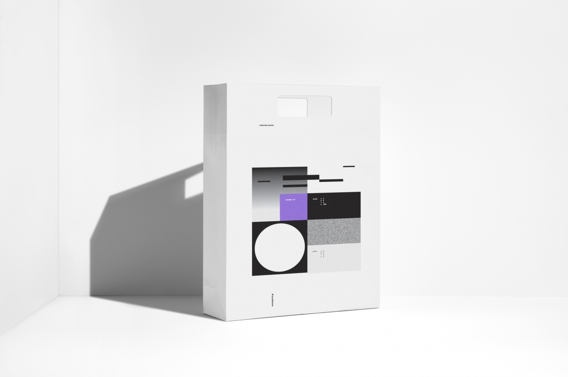
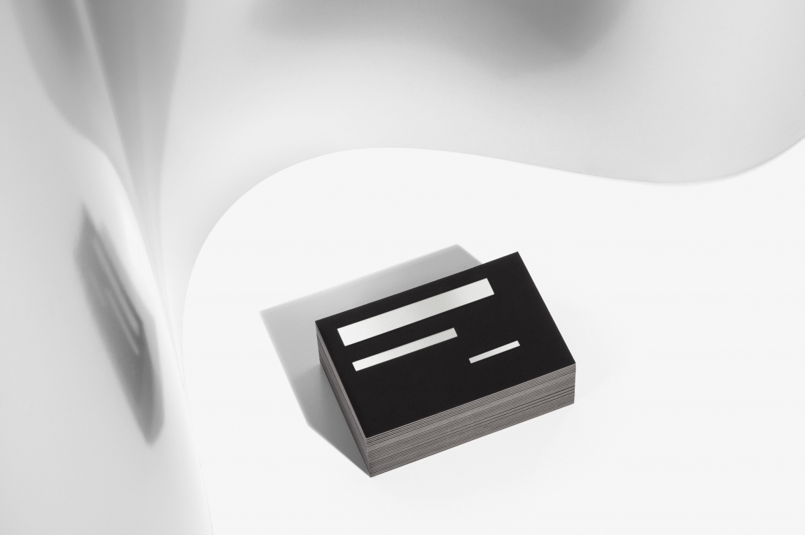
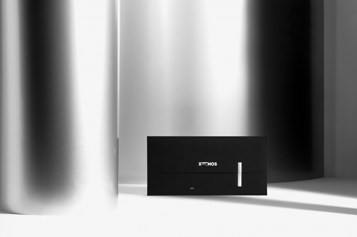
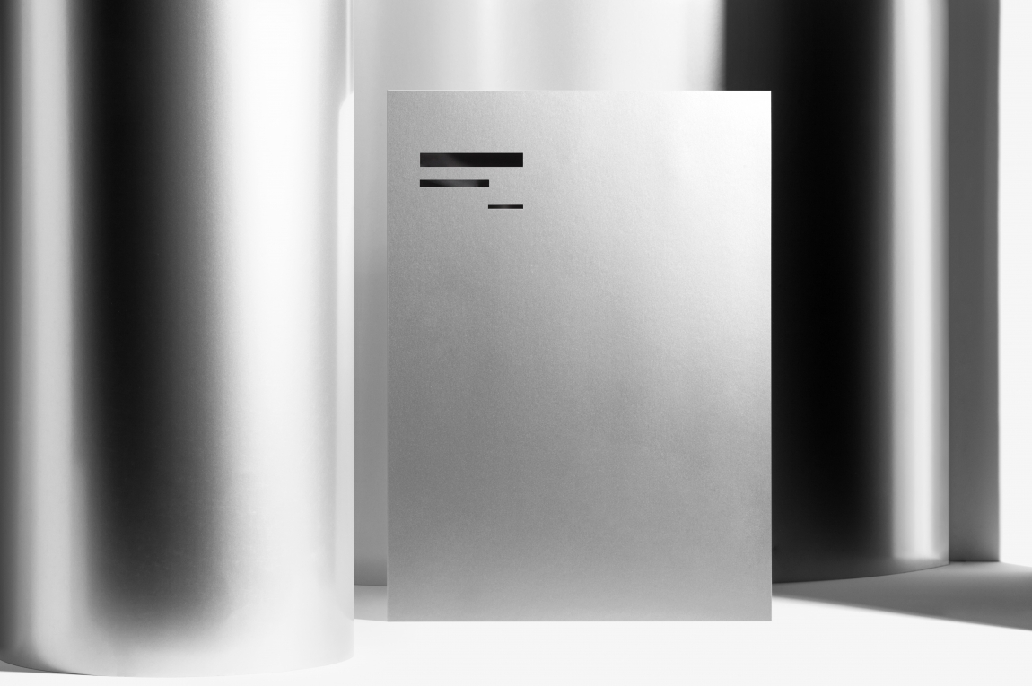
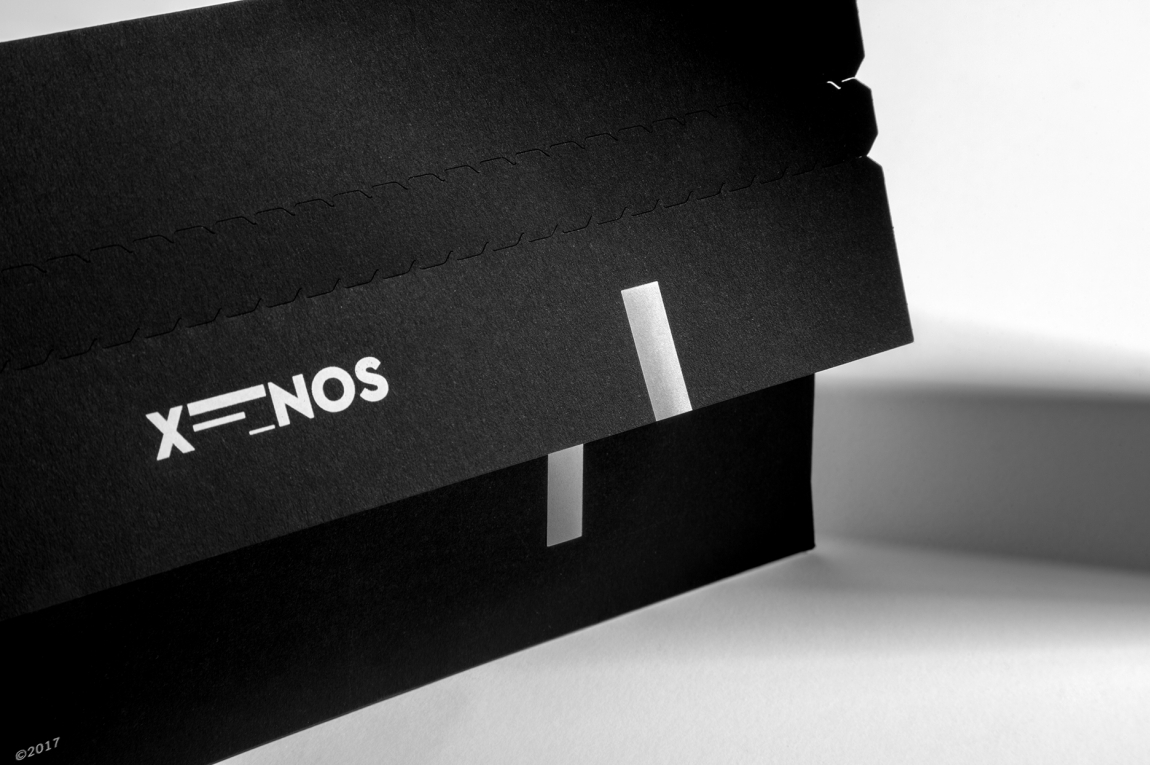
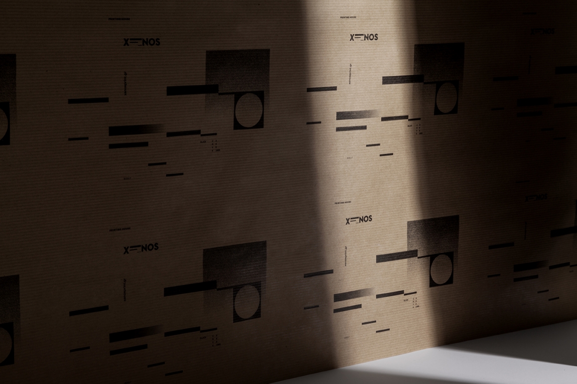
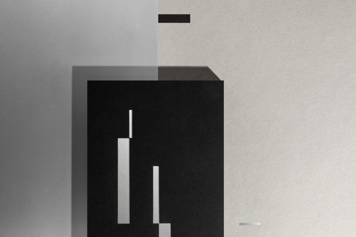
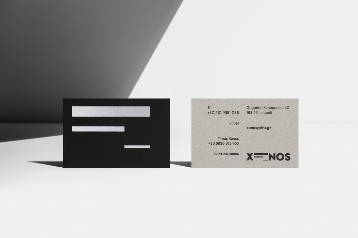
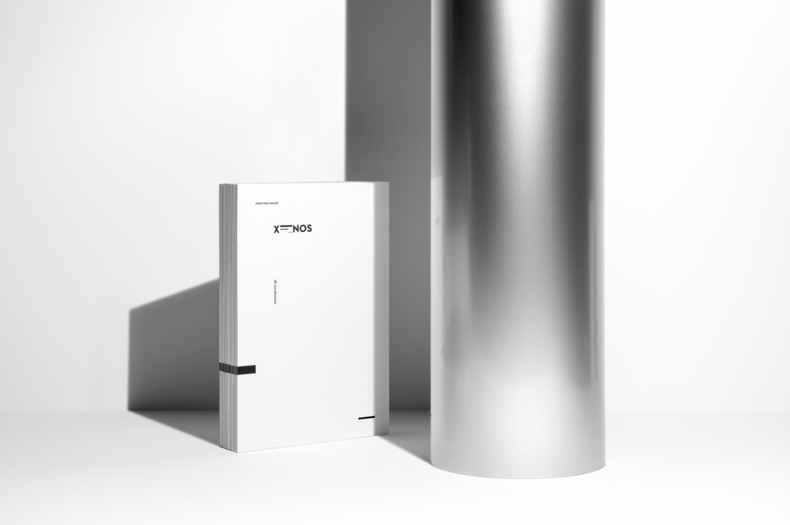
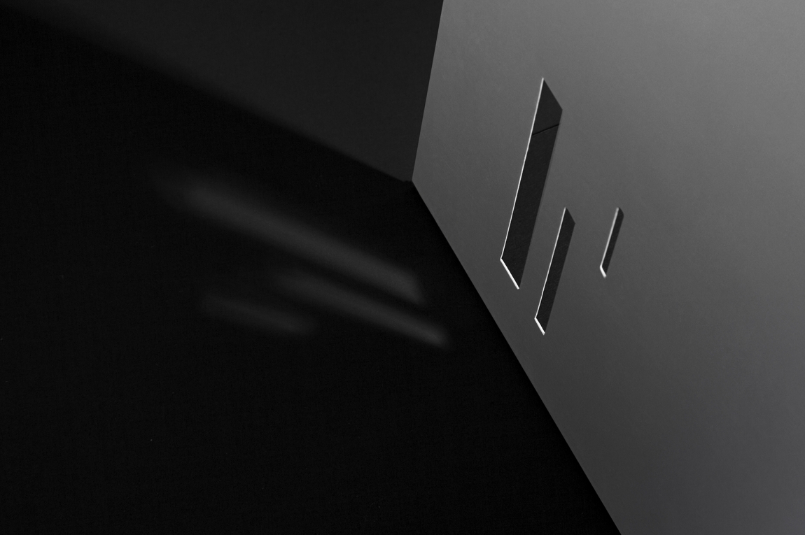
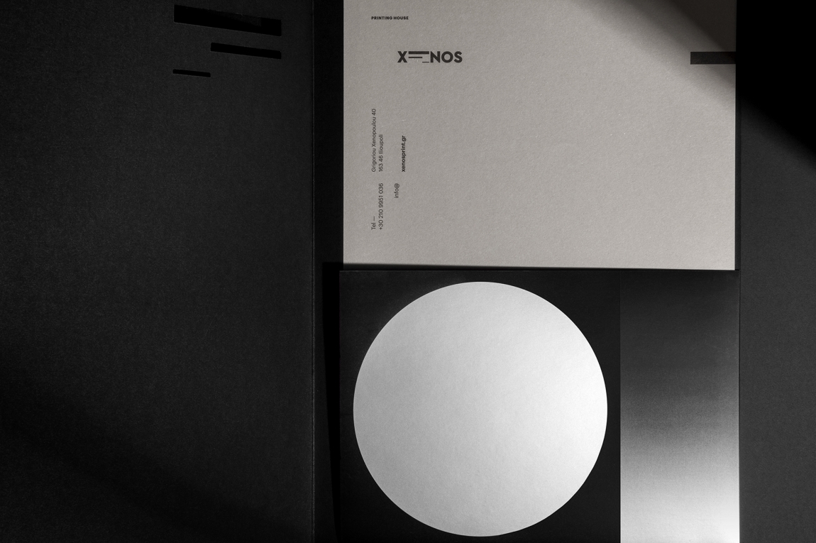
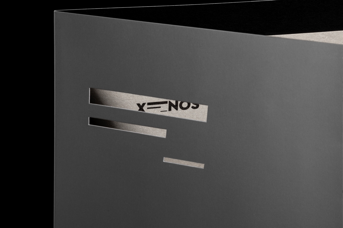
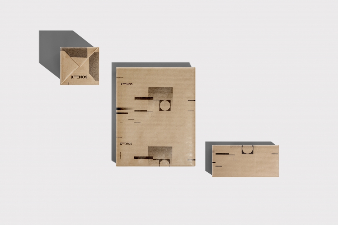
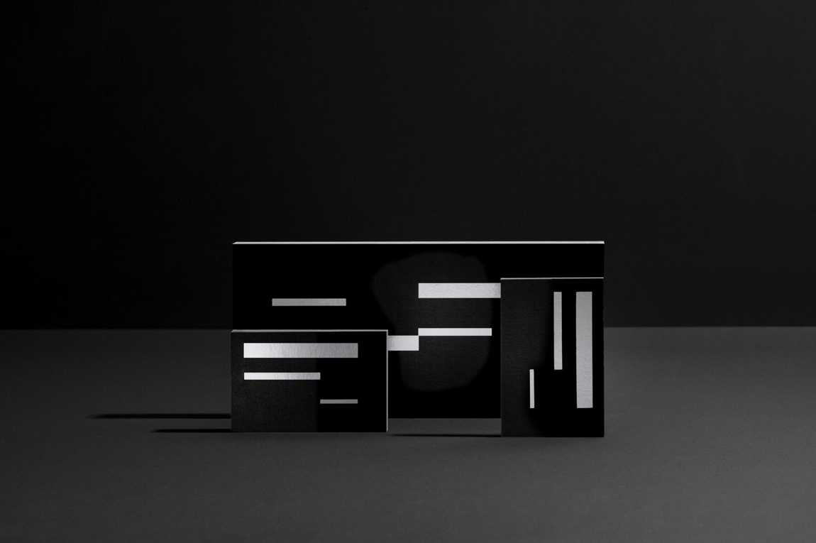
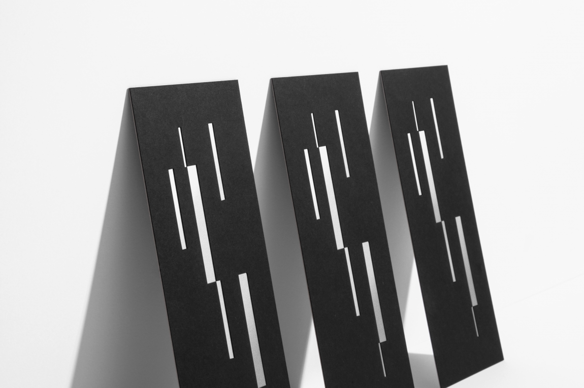
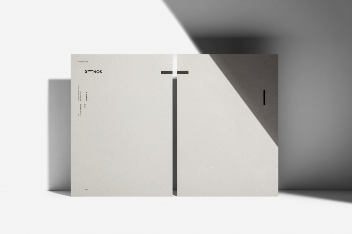
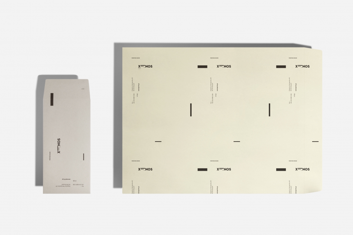
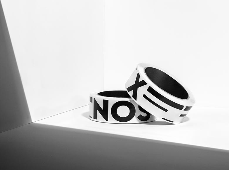
"Logotype and corporate identity for Xenos Printing House. For designing the logo, we used geometric forms as a degradation of the Greek letter ‘Ξ’. Inspiration came from the crop marks and matching points of the printheads, the composition of text by arranging physical types in typesetting, as well as the printing plates and the paper piles of the offset printing machine. Expanding that sense throughout the branding identity and its applications, we designed geometric elements, such as the cylinder, as a reference to the ecosystem of the printing house, creating compositions of monochromatic printing passes. For producing the applications, we chose special papers, combining different printing techniques. A noteworthy detail is the reference to the photo-transfer technique, a simulation of the printing plate on the corporate folder. The overall result narrates a story in abstraction of everyday life in this unique space." - Luminous Design Group
Client: Xenos Printing House
Design: Luminous Design Group